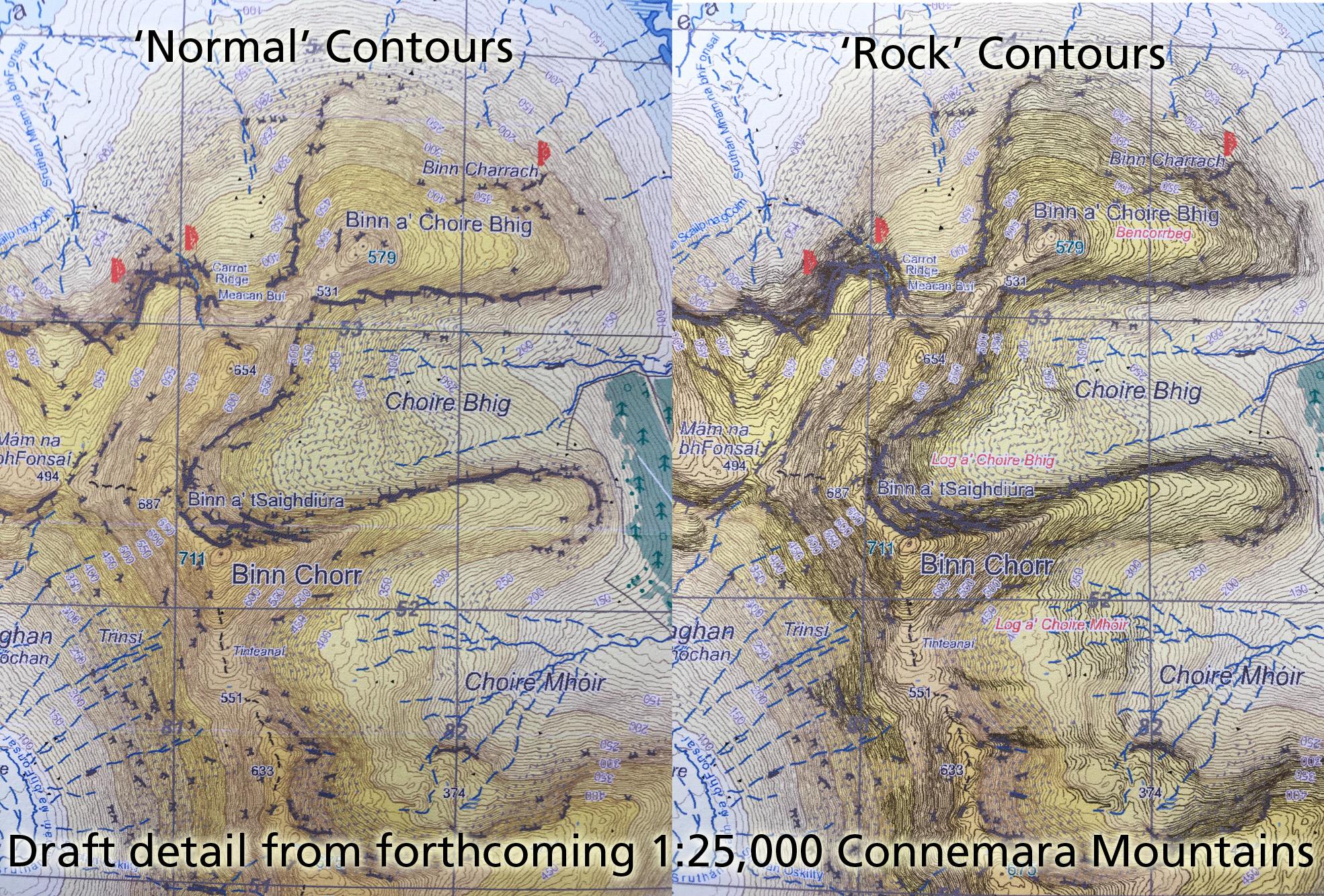
I’ve been making fairly steady progress on a new 1:25,000 scale map Connemara Mountains. Was planned to go to print by around month end but some fieldwork required and there are issues surrounding the ongoing virus situation that will delay this. The map will have a 5 metre contour interval in line with our other 25Series maps published in last few years. The resulting contour detail is very fine, bringing out many smaller features. I’ve adjusted the relief colouring to make this lighter overall to render the contour lines more legible.
One issue that is arising is if & how to represent the rocky parts of some of these hills. On previous maps I’ve used a rock pattern symbol for expanses of bare rock, however this would overwhelm the fine contour detail along the ridges of these hills. One idea I’ve been testing is the use of ‘rock contours’ i.e. depicting rocky terrain with contours lines that are rendered in a darker grey colour. Shown here is an extract with & without these ‘rock contours’. In practice the final result will be sharper that these photos of a draft print, but they show up some issues.
Overall the effect is pleasing as the rockier hills are ‘lifted’ off the page, there’s a sense that these areas are mountainy. However on the negative side, there’s a certain loss of clarity in other detail – particularly crags, cliffs, other rock detail & text. These are harder to read due to less contrast. In theory the darker contours should be easier to read but this lessening of clarity also takes away a little from them.
A little tinkering and experimentation will likely improve clarity a touch but I’m interested to hear of anyone else’s views of this technique and how useful or otherwise they have found it.